Colour theory is a vast and intriguing subject that encompasses various aspects of art and design. It delves into the relationships among colours and their psychological effects on human emotion and perception. Gaining an understanding of colour theory can greatly enhance an artist’s or designer’s capabilities in creating visually appealing and effective pieces.
Books about colour theory provide readers with comprehensive knowledge on the principles, techniques, and applications of colour in art and design. These books cover topics like colour mixing, colour harmony, and colour psychology, making them essential resources for artists, designers, and students in related fields.
Through studying colour theory, individuals can deepen their knowledge and refine their skills in their respective fields, ultimately allowing them to create more balanced, harmonious, and visually striking works. Whether a beginner or experienced professional, colour theory books offer valuable insights and guidance for every stage of the creative journey.
Basics of Color Theory
Color theory is a fundamental aspect of visual art and design, encompassing various principles and guidelines artists use to communicate with colors. The foundation of color theory lies in the color wheel, which presents colors in a circular arrangement, allowing artists to understand and manipulate relationships between them.
The color wheel consists of primary, secondary, and tertiary colors. Primary colors are red, blue, and yellow; they cannot be created by mixing any other colors. When primary colors are mixed in equal quantities, secondary colors are produced, namely green, orange, and violet. Tertiary colors emerge when mixing a primary and a neighboring secondary color, such as blue-green or red-orange.
Another essential component of color theory is the understanding of color harmony, which occurs when different colors complement each other aesthetically. There are several ways to achieve color harmony, including:
- Complementary colors: These are colors situated opposite one another on the color wheel, such as red and green or blue and orange. Their contrasting nature creates vibrant combinations.
- Analogous colors: These consist of adjacent colors on the wheel, providing a harmonious and often calming effect, like shades of green and blue.
- Triadic colors: Equidistant colors on the color wheel form a triadic color scheme, yielding a balanced and visually stimulating harmony, such as red, blue, and yellow.
Pigments play a vital role in the practical application of color theory, as they determine the actual colors that can be produced. Artists use pigments, which are colored powders, to create paints, inks, and other coloring substances. Pigments can be organic, derived from plants and animals, or inorganic, originating from minerals or synthesized chemically.
The comprehension of color interactions, also referred to as color relationships, is crucial for artists and designers. Artists must consider how colors influence each other when placed side by side, knowing that some combinations can create harmony and balance, while others can appear discordant or unappealing.
In summary, the basics of color theory encompass understanding the color wheel, achieving color harmony, and utilizing pigments to apply these principles in practice. Mastering these fundamentals empowers artists to create visually engaging and communicative works.
Understanding Interaction of Color

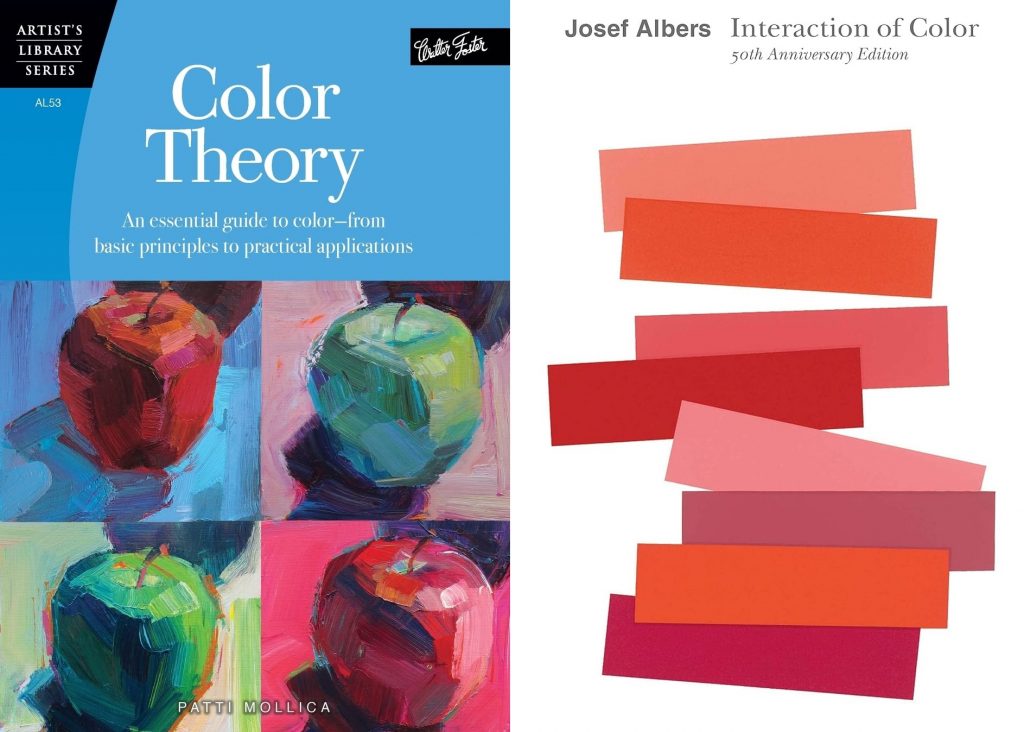
“The Interaction of Color“, written by influential artist and educator Josef Albers, is a significant work in the field of color theory. Initially published in 1963, it has since become a classic reference for artists and designers worldwide, providing them with a comprehensive understanding of how colors interact with each other. In 2013, the 50th-anniversary edition of the book was released, which includes commentary and reflections on the original publication.
The main focus of Albers’ book is the exploration of color relationships and the ways they can be manipulated to create visually stunning compositions. Through a series of visual experiments and exercises, Albers encourages readers to engage with colors in an interactive manner. He systematically illustrates the ways colors can seemingly change when placed in contrasting or complementing combinations.
“The Interaction of Color “challenges conventional beliefs about color by illustrating how context influences perception. For example, a color may appear warmer or cooler depending on the surrounding colors. Moreover, Albers demonstrates how the same color can appear entirely different when juxtaposed with other colors, highlighting the relativity of color perception.
In the 50th-anniversary edition, readers are treated to an expanded format that delves deeper into Albers’ methods and theories. The text is supplemented with engaging visuals, thorough explanations, and annotations, providing an accessible introduction to important concepts in color theory. Whether for an artist looking to improve their understanding of color or a newcomer wanting to explore the world of visual arts, this book serves as a valuable resource.
With the “Interaction of Color,” Josef Albers has left an enduring legacy in the world of art and design. His theories and innovative approach to color have greatly contributed to our understanding of the subject, inspiring generations of artists and designers seeking to harness the power of color in their work.
Color Mixing and Combinations
Effective color mixing and combinations play a pivotal role in the world of color theory. Getting the colors right can contribute significantly to the visual impact and harmony of the artworks or designs. Several books on color theory discuss the importance of mastering these techniques.
One of the most fundamental aspects of color mixing is understanding primary, secondary, and tertiary colors. Primary colors, such as red, blue, and yellow, cannot be created through mixing. Secondary colors, like green, orange, and purple, result from combining two primary colors. Tertiary colors are created by combining a primary color with an adjacent secondary color.
In addition to mixing, books on color theory also emphasize the use of complementary colors. These are colors that lie directly opposite each other on the color wheel, such as blue and orange or red and green. The strategic use of complementary colors can create a strong contrast, balance, and harmony in the design.
A few noteworthy books that shed light on color mixing and combinations include:
- Color Choices: Making Color Sense Out of Color Theory by Stephen Quiller: This book explains the intricacies of color mixing and its practical applications. It offers insights into successfully using color harmonies and contrasts in artwork or design.
- Interaction of Color by Josef Albers: A classic book on color theory that explores the perception of color. Albers demonstrates how colors can influence each other, depending on the combinations used in a composition.
By studying books on color theory, artists and designers can confidently and effectively employ color combinations to amplify the appeal of their creations.
Influence of Color Choices
Color choices play a significant role in the world of design, art, and even everyday life. Understanding color theory helps individuals make informed decisions when selecting colors for various purposes.
Color psychology delves deeper into the emotions and reactions that specific colors can evoke in people. For instance, red is often associated with passion and excitement, while blue conveys a sense of calm and tranquility. Knowledge of color psychology enables designers to create impactful design solutions that consider their audiences’ emotional states.
Color choices also influence the effectiveness of color work in visual communication. A harmonious color palette can enhance aesthetic appeal and create a clear, visually pleasing environment. Contrarily, poor color choices can lead to illegible text, unclear messages, and unappealing visuals.
Color theory serves as a foundation for making informed color choices. These principles help determine compatible colors and ensure that they work harmoniously in design projects. An understanding of concepts like color harmony, contrast, and balance is essential for creating professional and impactful color work.
In conclusion, the study of color theory and the impact of color choices on people’s emotions and actions is crucial for successful design solutions. It is important for artists, designers, and everyday individuals to acknowledge the power of color and make informed choices that serve the intended purpose and resonate with their audience.
Practical Guide to Color Schemes

Color theory plays a significant role in design, art, and other visual mediums. One important aspect is the development and application of color schemes. One such resource for understanding color combinations is Sanzo Wada’s “A Dictionary of Color Combinations.”
Sanzo Wada, a prominent Japanese designer, created this comprehensive guide to help artists and designers make informed decisions on color schemes. The dictionary contains various color combinations, showcasing colors that harmonize well together. It enables users to discover distinct and original color schemes, which can greatly enhance the visual appeal of their works.
The practical application of color schemes involves not only the selection of complementary colors but also the consideration of various other factors, such as saturation and value. Many visual artists use these factors to strike a balance between harmony and contrast in their works. Knowledge of color theory and schemes can, therefore, play a significant role in enhancing the overall visual impact of a piece.
When choosing an appropriate color scheme, consider the following aspects:
- Complementary colors: These colors are opposite each other on the color wheel and create strong contrast when used together.
- Analogous colors: These colors are adjacent to each other on the color wheel, creating a sense of harmony and uniformity.
- Triadic colors: This scheme involves using three colors evenly spaced around the color wheel, resulting in a dynamic and vibrant combination.
Sanzo Wada’s “A Dictionary of Color Combinations” is an essential resource for anyone aspiring to grasp the nuances of color theory and apply it to their work. By learning and experimenting with various color schemes, visual artists and designers can improve their creations and generate a more impactful and stimulating experience for their audience.
Books on Color Theory
Color theory is a vital subject for artists, designers, and individuals looking to learn more about the science and psychology behind colors. There are several books available that provide valuable insights and practical knowledge about color theory. Here, we will discuss a few notable books on this topic.
Color Problems: A Practical Manual for the Lay Student of Color

“Color Problems: A Practical Manual for the Lay Student of Color” is a timeless classic written by Emily Noyes Vanderpoel in 1901. Although this book is more than a century old, the principles and methods illustrated within its pages still hold relevance today. Vanderpoel breaks down the complexities of color theory into simplified, practical techniques that can be applied by students from various backgrounds.
Color Choices: Making Color Sense Out of Color Theory

Another essential book for students of color theory is “Color Choices: Making Color Sense Out of Color Theory” by Stephen Quiller. This book covers the different aspects of color theory, including the color wheel, color schemes, color harmonies, and the psychology of color. Quiller also presents his unique “Quiller Wheel,” a visual tool designed to demonstrate the relationships between colors. This allows readers to make informed decisions when selecting and combining colors in their work.
These are just a few of the many books available on color theory, and each provides valuable insights for artists and designers seeking to understand the principles of color. To choose the best book for your needs, consider your background and specific interests, as well as the scope of your artistic or design projects. With the help of these resources, you can improve your skills in color selection, application, and understanding of the emotional impact of color.
The Role of Pigments in Art

In the realm of color theory, pigments play a critical role in the creation of art, as they are the primary means by which artists express themselves. The use of pigments dates back to prehistoric times when natural materials, like minerals and animal bones, were employed in creating art.
Artists have always been fascinated by the interplay between pigments, light, and the human perception of color. This fascination continues to influence art and design, as well as scientific research. Eminent artists, such as Michelangelo and Van Gogh, skillfully used pigments to create visually stunning multi-dimensional effects in their works.
Learning and understanding color theory is crucial for artists. “Drawing on the Right Side of the Brain,” by Betty Edwards, offers valuable insights into the importance of balancing color and form, thereby reinforcing the role of pigments in the creative process. In addition, many art schools include color theory in their curriculum to ensure that students develop the necessary skills to make informed decisions about color choices and understand the impact of different pigments on their artworks.
The understanding of pigments is not limited to traditional artists; it is equally relevant for graphic designers and digital artists. Professionals in these fields often rely on color theory principles to create harmonious design, evoking specific emotional responses in their target audience. Pigments in digital media are created using a combination of primary colors, like red, green, and blue (RGB), to produce a diverse range of hues and shades.
In conclusion, pigments have a profound influence on the world of art and design. By mastering the properties and behavior of pigments, artists can create visually captivating and expressive artworks, while designers can achieve optimal results in their projects. From traditional mediums to digital applications, pigments continue to drive the evolution of artistic expression and design aesthetics.
Digital Art and Color Theory

In the realm of digital art, color theory plays a vital role in creating visually appealing and impactful illustrations. With the evolution of technology, digital artists and illustrators have access to various tools and software that can elevate their work in terms of color combinations and usage.
One aspect to consider is the color wheel, which represents the relationships between primary, secondary, and tertiary colors. Understanding how to utilize these relationships can greatly enhance an artist’s ability to create harmonious color schemes. For example, complimentary colors, which lie opposite from each other on the wheel, can create a dynamic and vibrant contrast in digital illustrations.
Another core principle in color theory that digital artists should familiarize themselves with is the difference between additive and subtractive color mixing. In digital art, the additive color model is predominantly used, with colors being produced by combining varying levels of red, green, and blue (RGB) light. This differs from the subtractive model used in traditional painting, which relies on the interaction of pigments.
Experimenting with color modes within digital art software can also be beneficial. For instance, the Hue, Saturation, and Brightness (HSB) mode provides artists with the ability to control colors more intuitively by adjusting individual attributes.
Further, studying the works of successful digital artists can offer valuable insights into effective color usage. Some books on color theory that may prove helpful for digital artists and illustrators include:
- “Color and Light: A Guide for the Realist Painter” by James Gurney.
- “The Painter’s Guide to Color” by Stephen Quiller.
- “The Painterly Approach” by Bob Rohm.
Ultimately, a strong grasp of color theory can significantly elevate the quality and impact of digital illustrations. By utilizing the principles from traditional color theory and adapting them for the digital medium, artists can create visually striking and harmonious work that resonates with their intended audience.
Patti Mollica’s Approach to Colour

Patti Mollica, a renowned artist and author, offers a unique perspective on colour theory. With her professional experience in various mediums, she simplifies the complex world of colour for artists of all skill levels.
In her book, “Color Theory: An Essential Guide to Color-from Basic Principles to Practical Applications,” Mollica focuses on teaching readers effective use of colour. She covers topics such as colour relationships, mixing colours, and developing cohesive colour schemes. Her approach emphasizes the importance of understanding colour harmony principles and how they relate to successful art compositions.
Mollica advocates for the intentional use of colour, and she provides practical tips for achieving desired colour effects. For example, she advises artists to use warm hues to bring objects forward in a composition and cool hues to push them back. She also addresses common colour challenges and problems, offering solutions that are easy to apply in real-world scenarios.
Throughout the book, Mollica utilizes visually appealing examples of her artwork to demonstrate the various concepts she discusses. This approach not only showcases her expertise as an artist but also helps readers build a solid foundation in colour theory.
Betty Edwards and Color Theory

Betty Edwards is an influential figure in the world of color theory. As an American art teacher and author, her expertise has guided countless individuals in understanding and applying the principles of color to their work. One of her most famous publications, “Color: A Course in Mastering the Art of Mixing Colors,” is considered a valuable resource for many artists, designers, and students.
Edwards’ book delves into the science and psychology behind colors, exploring how humans perceive and interpret them. She provides a solid framework for comprehending color relationships and constructing harmonious color schemes. By breaking down complex color concepts into digestible components, readers can gain insight into the powerful impact that color can have on a composition.
In “Color,” Edwards combines practical exercises with meticulous explanations, allowing readers to practice color mixing and apply theory to their creative endeavors. The book also discusses traditional and contemporary color wheel models and presents a range of real-life examples, demonstrating the versatility and potential of color theory across various disciplines.
Throughout her career, Betty Edwards has played a significant role in expanding color understanding and knowledge. Her teachings continue to empower artists and designers to make informed color decisions, elevating the visual communication and aesthetic appeal of their work.
James Gurney’s Color and Light

James Gurney, a renowned artist and author, has written an exceptional book on color theory called “Color and Light.” This book offers a comprehensive and practical guide to understanding and mastering the use of color and light in a wide range of artistic applications.
The book explores various aspects of color theory, beginning with a brief history of color and light studies. It then delves deeper into the science behind color and light, including ideas from well-known artists and scientists such as Johannes Itten, Isaac Newton, and Albert Munsell.
Gurney details numerous color schemes and strategies, providing artists with a solid foundation for their creative work. These strategies enable artists to manipulate color harmonies, create depth, and evoke different moods through their artistic choices. “Color and Light” also covers essential principles of lighting, shadow, and reflections, which are key to creating realistic and visually appealing artwork.
Throughout the book, Gurney includes insightful examples from his own work, as well as other accomplished artists, to illustrate the concepts discussed. His approach to teaching is both clear and engaging, making the book accessible to beginners and experienced artists alike.
In summary, James Gurney’s “Color and Light” is a valuable resource for artists seeking to enhance their understanding of color theory and its applications in their artwork. The book is filled with practical advice, useful exercises, and captivating examples, guiding readers on their journey to master the intricacies of color and light.